5 Things You Should Know About Squarespace Web Design
Whether you’re designing a new website yourself (woohoo!) or you’re working with a professional web designer to create the custom site of your dreams, there’s a good chance you won’t need to know a ton about how exactly your website functions “under the hood.”
Platforms like Squarespace (my favorite!) make it super easy to build and maintain your own website without knowing how to code.
But, that said, there are certain underlying structures that are important to know about as you design your website, because they influence what you can (and can’t!) do design-wise.
Sure, almost anything is possible with the creativity and coding skill to make it happen… but pushing the limits of the natural structure and function of your website is not the most cost-effective way to build one. 😊
With that in mind, here are five key things that help explain the back-end structure (and limitations) of Squarespace web design, so you can better understand how to work with this structure to create the best possible website for your needs.
Squarespace web design basics
You don’t have to know a coding language to build a website these days, but here are some key things to know about how Squarespace websites are built and function:
1. It’s a grid!
One of the top structural things that confuses people new to Squarespace (or web design in general) is that a website is not a blank canvas you can draw on as you’d like.
In Squarespace, page elements exist within a grid structure. The grid is organized in 12 columns, and this defines how we can lay out a webpage.
In the example below, you can see how each element on the page fits within this grid:
**All the elements above happen to be image blocks, but the same structure applies to any Squarespace element (text blocks, spacer blocks, newsletter blocks, summary blocks, etc.).
A professional web designer can custom code elements to have a specific position that’s more flexible than this… but, in general, every Squarespace website is built around this 12-column grid and it’s helpful to keep that in mind when understanding how elements will lay out on the page.
This is particularly important when working with rows (such as rows of photos). Squarespace is magical in that it will automatically adjust the sizing of your photos if you drop image blocks properly into the grid structure.
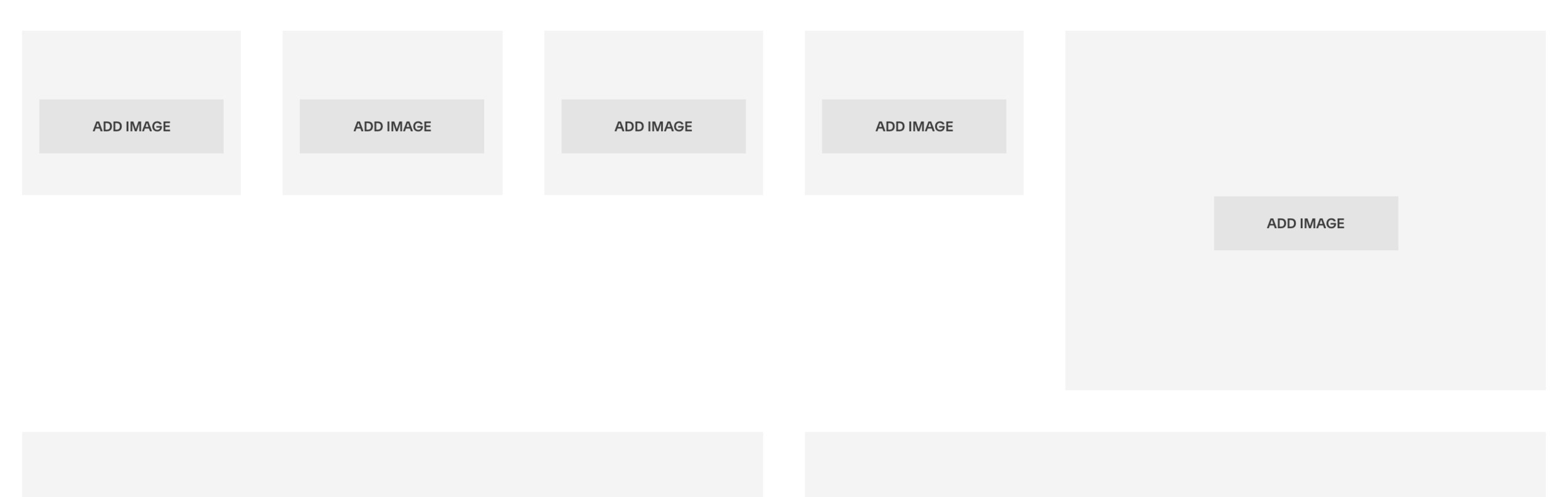
For example, if you have a row of two, three, four, six images, etc., you can easily drag them to be consistently sized within that row:
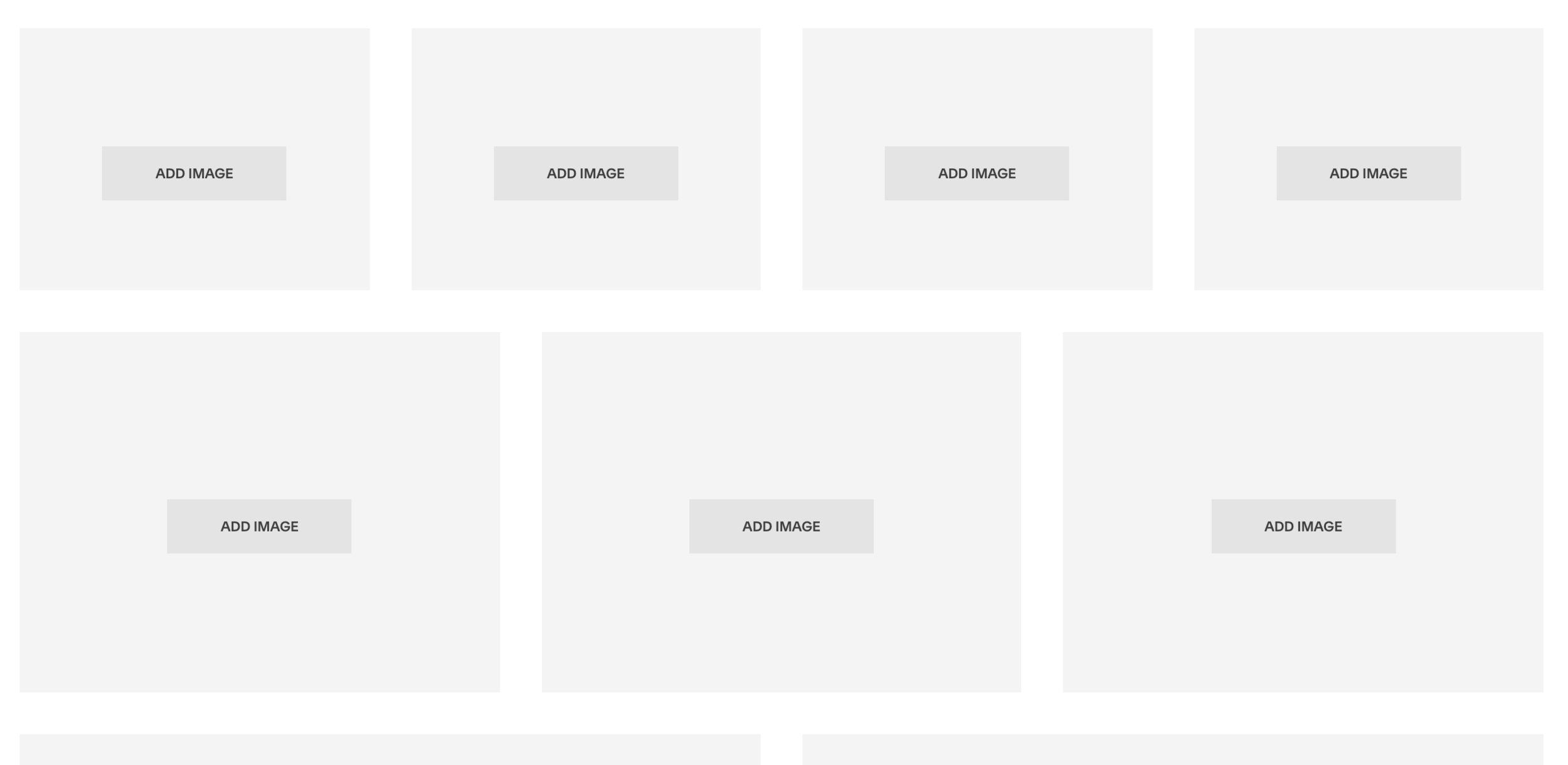
This works because the number of images we’re using are all divisors of 12.
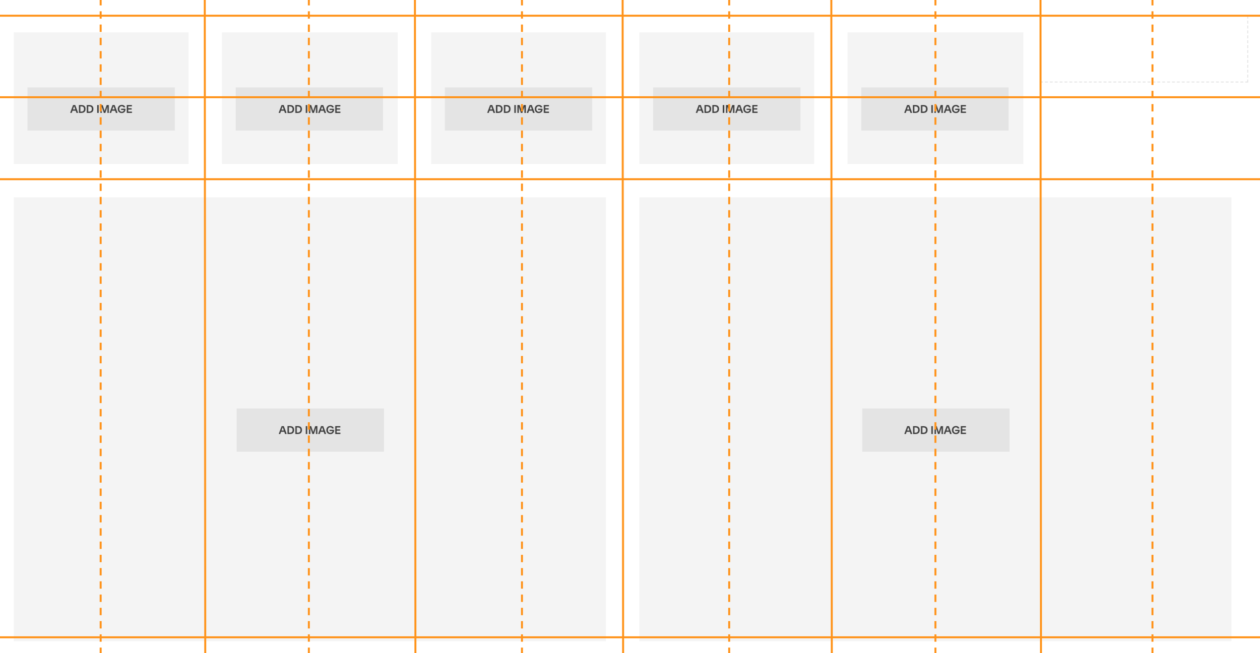
However, it does not work as well to place rows of five or seven images, etc.—because they’re not divisors of 12, so they can’t evenly distribute themselves in the 12-column grid.
As you can see below, when we try to place five images in a row, one of these images takes up two spaces on the grid (making it oversized):
The way around this is to use spacer blocks, which is my next key Squarespace tip:
2. Spacer blocks align your elements
Squarespace’s spacer blocks are your best friend for positioning and aligning elements on your website as you’d like.
They do just as their name suggests: add space. More specifically, they take up space in your “grid” as needed.
In the example above with the row of five images, we can use a spacer block to get that fifth image properly sized.
(Of course, one of the important things to note here is that the row of images must be right-aligned or left-aligned, as there would always be an odd number of grid “spaces” on either side, so it’s not possible to center these five images on the page.)

Spacer blocks can be dragged to expand or shrink to the desired width (anything from one grid space to all 12 grid spaces).
They can also expand vertically: simply drag a spacer block down to create more vertical space. However, every spacer block on your website has a set minimum height. To change this, you’ll need custom code.
3. Page elements stack on mobile
As you’ve likely noticed, websites look a bit different on mobile devices than they do on your computer screen.
Squarespace websites are built with responsive design, meaning their display varies based on the size of the screen the website is being viewed on. This is great, in that it keeps your website looking fantastic whether it’s being viewed on desktop, mobile or tablet screen sizes.
But, when designing your website (or speaking with your web designer about it), it’s important to understand how what you’re seeing on desktop will translate to mobile.
For example, columns on desktop will not display as columns on mobile—they’ll be “stacked.” This is important to keep in mind, because their contents must make sense in this arrangement on mobile.
On Squarespace websites, elements stack left to right. So, in a row, any element on the left will appear above an element to the right of it.
Here’s an example of how the same elements on desktop will stack on mobile:


One of the reasons I love Squarespace is that your entire website is constructed to be mobile responsive by default. So, you don’t have to do anything to make your pages mobile responsive—you just need to understand the structure and “rules” for how they will lay out on mobile screen sizes.
💸 Use code PARTNER10 for 10% off your subscription
That's an affiliate link, through which I may earn a commission if you choose to purchase, at no additional cost to you. Of course, Squarespace is a product I personally use & love!
4. Websites are built with only four font styles
Another key structural element of web design that tends to confuse people is the concept of font. Many people assume that text on websites is built like it is in a word processor: you have complete control over every letter on the page—what font family, size, color, style would you like it?
Not so with web design.
In web design, you get four main font “styles”: h1, h2, h3 and p. These stand for “Heading 1,” “Heading 2,” “Heading 3,” and “Paragraph,” respectively. (If you’re on Squarespace 7.1 you’ll also have a Heading 4 style.)
Each of these groups is styled with its own specific settings:
font family: for example, Arial, Helvetica, Baskerville, etc.
font size: the size of the font on the page
line height: spacing between lines
letter spacing: spacing between letters
text transform: capitalization (options are none, uppercase, lowercase, capitalize all words)
text decoration: italic, underlined, etc.
So, each of these typography groups (h1, h2, h3, p) gets specific styles in the back-end of your site, via Design > Site Styles.
And then, you format your text with these options throughout your site—you’ll see Heading 1, Heading 2, Heading 3 and Normal (Squarespace’s name for the “Paragraph” font style) listed in the dropdown menu in the text editor of any text block:

It’s important to understand how your website’s fonts work because, without custom code, you have access to only four font styles to use throughout your entire site. So, it’s essential to choose these styles wisely, so they can be versatile for many different uses.
(Sometimes, people style one of their font options for something really specific, which means it’s not very applicable for use in other parts of their site—so they’ve limited themselves by making that style inaccessible for other uses. And, as I’ll cover below, it’s important to have access to all of your heading styles for SEO purposes.)
5. SEO isn’t magic; it’s keywords
I get a lot of inquiries for help with SEO (search engine optimization, the process of helping search engines like Google better see and understand your website content, so they can rank it higher in search results for relevant queries).
SEO is not a mystical and magical formula. It’s not a secret sauce. It’s not something that gets “added” to your site by a professional and then is good to go forever.
SEO is simply the strategic, consistent use of relevant keywords, in all the “key” places. (Pardon the pun!)
These keywords need to be baked into your site, from titles to page text and headings to blog post metadata. And you need to continue adding them in regularly—for example, via blog posts (one of the best ways to grow your site’s SEO and search ranking!)
Good SEO is definitely a process, and it takes time to establish. It also continues to grow over time, as you add more content to your website.
So, this is one of the key, foundational things to understand about your Squarespace website: SEO is not something to pay a professional to set up for you once; it’s something to be sure you’re educated on so you’re able to continue to maintain and grow it over time!

Improve SEO on your Squarespace website!
Grab my free checklist for boosting search engine visibility + ranking: